 DevSnap
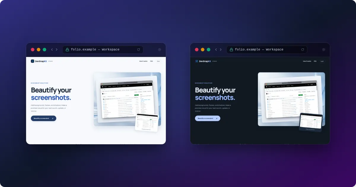
How to build one
- Open the studio in Duo mode with the button above.
- Import the “before” screenshot, then add the “after” screenshot as the second image.
- Choose a layout: Side by Side for equal weight, Hero Split to emphasise the new version, Overlap Stack for a layered look, or Stacked Vertical for tall formats.
- Apply the same frame to both so the comparison is fair, then export.
Make the change obvious
Capture both states at the same size and zoom, from the same scroll position. Add short “Before” and “After” labels with the text tool, and keep the background neutral so the eye goes to the difference. For changelogs and release notes, 16:9 or Twitter/OG sizes work well; for a carousel slide, try 1:1.
Want a ready-made design? The template library includes a designed “Before & After” template with Pro. The Duo layouts above are free.
Good uses for a comparison
- Redesigns — old and new UI at the same size.
- Bug fixes — the broken state next to the fixed one in a release note.
- Light vs dark mode — the example above shows one page in both themes.
- Performance — two dashboards or reports with the key number visible.